Python Libraries: Matplotlib
Matplotlib is a Python graphing library. To use Matplotlib, it must first be imported as follows:
import matplotlib.pyplot as plt- Line Plot:
plt.plot([x values],[y values]) - Scatter Plot:
plt.scatter([x values],[y values]) - Title:
plt.title("title") - X-axis Label:
plt.xlabel("x axis") - Y-axis Label:
plt.ylabel("y axis") - Gridlines:
plt.grid() - Legend:
plt.plot([x values],[y values],label="plot 1"); plt.legend() - Show Plot:
plt.show()
Using Numpy
Numpy’s linspace and arange functions are usually used to generate the x values
For example, plot  and
and  on the same plot over the domain
 ![x\in[0,10]](https://engcourses-uofa.ca/wp-content/ql-cache/quicklatex.com-3e4392278d6e6597c777ba939de36613_l3.png "Rendered by QuickLaTeX.com") :
:
import numpy as np
import matplotlib.pyplot as plt

x = np.arange(0,10,0.01)
y1 = np.sin(x) + x
y2 = np.cos(x)
plt.plot(x, y1, label="y1")
plt.plot(x, y2, label="y2")
plt.title("y1 vs y2")
plt.xlabel("x")
plt.ylabel("y1 and y2")
plt.legend()
plt.grid()
plt.show()
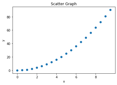
For example, plot  over the domain as a scatter graph and a line graph on separate plots
import numpy as np
import matplotlib.pyplot as plt

x = np.arange(0,10,0.5)
y = x**2

plt.plot(x, y)
plt.title("Line Graph")
plt.xlabel("x")
plt.ylabel("y")
plt.show()

plt.scatter(x, y)
plt.title("Scatter Graph")
plt.xlabel("x")
plt.ylabel("y")
plt.show()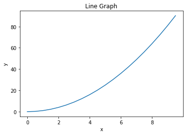
Using Sympy
For example, plot and on the same plot over the domain as Sympy expressions:
import numpy as np
import sympy as sp
import matplotlib.pyplot as plt

x = sp.symbols('x')
y1 = sp.sin(x) + x
y2 = sp.cos(x)
x_val = np.arange(0,10,0.01)
plt.plot(x_val, [y1.subs({x:i}) for i in x_val], label="y1")
plt.plot(x_val, [y2.subs({x:i}) for i in x_val], label="y2")
plt.title("y1 vs y2")
plt.xlabel("x")
plt.ylabel("y1 and y2")
plt.legend()
plt.grid()
plt.show()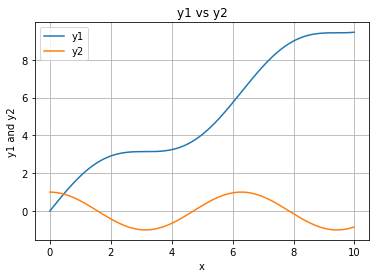
For example, plot the Sympy expression over the domain as a scatter graph and a line graph
import numpy as np
import sympy as sp
import matplotlib.pyplot as plt

x = sp.symbols('x')
y = x**2
x_val = np.arange(0,10,0.5)

plt.plot(x_val, [y.subs({x:i}) for i in x_val])
plt.scatter(x_val, [y.subs({x:i}) for i in x_val])
plt.title("Line and Scatter Graphs")
plt.xlabel("x")
plt.ylabel("y")
plt.show()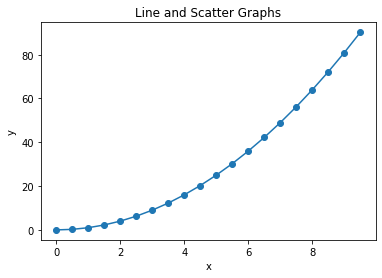
Using Raw Data
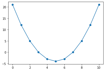
For example, plot the following data points as a line graph and a scatter graph:
Data = [[0,21],[1,12],[2,5],[3,0],[4,-3],[5,-4],[6,-3],[7,0],[8,5],[9,12],[10,21]]
import matplotlib.pyplot as plt

Data = [[0,21],[1,12],[2,5],[3,0],[4,-3],[5,-4],
        [6,-3],[7,0],[8,5],[9,12],[10,21]]
x_val = [point[0] for point in Data]
y_val = [point[1] for point in Data]

plt.plot(x_val, y_val)
plt.scatter(x_val, y_val)
plt.show()